Showing posts with label idents. Show all posts

Friday, 15 December 2017

SLASHER CONVETIONS: 1 Idents

Look at our previous blogpost about  GENERAL CONVENTIONS Movie Idents for the whole outline of the conventions for idents and an example of the variants used in Friday 13th II

Generally


In general the company Idents for slasher movies are as a basis, like any other ident. However some companies focussing more on horror will have signifiers and other sorts of tweaks to anchor that they are doing a horror movie. For example, Blumhouse Productions is a production company who have made countless horror movies such as  Insidious(James Wan)(2011), Paranormal Activity(Oren Peli)(2009) and Split(M. Night Shyamalan)(2017). Their ident is filled with horror signifiers, intertextuality, creepy colour schemes, some dutch angles (connoting something is odd), shaky cam (common in low budget horrors). Here is a full clip of their ident below
...
...
Apart from this very different example the idents for the most part are the same as any other ident.

Variants


Another way that idents for slashers can be altered to connote and anchor the horror genre is through variants. There is already an example in another blogpost(mentioned above).  The ident with LionsgateTwisted Pictures for Jigsaw(Spirit Brothers)(2017) has a high amount of intertextuality with the SAW franchise. The cable wrapping around the metallic cables and then being tightened gives a very torturous feeling. The cables then release at an extremely high rate and leaving "blood scrapes" on the letters. It is such a gruesome and SAW like way to kill a person, therefore very fitting for the movie. 
...
...

The New Line Cinema variant for the Friday 13th franchise is a very famous example. (see previous blogpost) The audio is what strikes me the most after the obvious colour scheme change. With the creepy, ominous, slow soundtrack and the sound of knives being sharpened. This approach to an ident has made it overall very effective and fitting to the franchise. 

Our Idents


...
...

For LugNut Productions we chose not to have any music as to follow the ambient sound approac. It is also more effective this way as we hear the sound of the lug nut being put onto the floor and the wrench turning back. This can somewhat give a hint of horror as there is often tools being used to kill off characters in slasher movies.

...

...

For Gingerbread Films we chose to have an animation again with ambient sound as we wanted to emphasise the chewing effect on the gingerbread man. It is a bit of an inside joke our group had as there are two members with ginger hair. We made it so the gingerbread man would slowly become more dead and it links in more with the zombie horror genre we were originally planning, however it also fits well with our new idea.

...
...

Our most horror based ident is definitely Clinnick Media. We are simulating opening a bag of guts and pulling out the company name. It is a play on the words Clinic as Clinnick is the last name of one of our members. Therefore we gave the ident the feeling that a  surgery is happening, with the white latex gloves and absurd amount of blood everywhere. It also has eerie music over it as the sequence plays out. With the red colour scheme of the ident it anchors the horror genre very well

Tuesday, 12 December 2017

Tuesday, 21 November 2017

PODCAST 4 - Change of idents and new roles

...

...

  • Change of idents
  • New roles that have been implemented 
  • What will happen next week 

Wednesday, 8 November 2017

PLANNING: Locations, Cast, etc.

Ideas for Miss-En-Scene:

  • Fake cig 
  • Vodka bottle filled with water
  • Campsite sign
  • Zombie missing hand
  • Torn clothing
  • Fake blood for victims 
Music:
  • Mysterious
  • The pitch/ bpm will increase before first death
  • Slightly eerie tones
  • An audio bridge over the tiles
Titles:
  • Redish font, will appear/ fade to dark scenery slowly
  • Serif font 
Idents:
  • Coated in red
Locations:
  • Woods
  • Back/ country roads
  • Field
Cast:
  • 5 characters
  • Driver (Single) - Confirmed (Final girl)
  • Couple (Both mature) - Confirmed (Female is scream queen)
    • We are reversing the roles to counteract the normal stereotype of scream queen/ final girl
  • Couple (Both immature) - Male confirmed, Female TBC
  • Make-up artist -Confirmed
  • Zombies - 2 confirmed

Thursday, 2 November 2017

PODCAST 2 Ident ideas in depth

...

...

  • Ginger bread productions
    • Long shot over GBM
      • camera zooms in - shadow of hand cast over GBM
    • See the change of GBM facial expressions
    • Hand takes buttons etc
      • GBM screams 
      • Sound FX of eating
    • Hand takes GBM
      • crumbs spelling "GB productions left behind"

PODCAST 1 - Introduction to film opening

...

...


  • Idea from film opening 
    • Horror
    • Friday the 13th inspired
  • Ident ideas 

Wednesday, 11 October 2017

TITLES film "Austin Powers"


TITLE
Number of people/company names in titles: 27
Start/end time of main titles: 0:15-0:27, 1:35-5:07
Running time of main titles: 12 seconds for first set of titles, 3 minutes and 32 seconds
Titles in order using exact text: 

Capella International/ KC Medien Presents
In Association with New Line Cinema
A Moving Pictures/Eric's Boy Production
Mike Myers
Elizabeth Hurley
Michael York
Mimi Rogers
Robert Wagner 
Seth Green 
Fabiana Udenio 
Mindy Sterling
Paul Dillon
Charles Napier
Casting by John Papsidera
Music by George S. Clinton
Costumes Designed by Deena Appel
Editor Debra Neil-Fisher 
Production Designer Cynthia Charette
Director of Photography Peter Deming 

Executive Producers Eric McLeod 
                                      Claire Rudnick Polstein

Produced by Suzanne Todd
                        Demi Moore
                        Jennifer Todd
                        Mike Myers

Written by Mike Myers
Directed by Jay Roach


TITLES ANALYSIS 1: THE COMPANIES
There was 5 companies who were titled and these are the companies that help present and produce the film. Whereas the rest of the titles are people who either help create the mise -en-scene or the main stars/actors and actresses in the movie. These companies help finance the film and help get it to the cinema's/produce or publish the film.
TITLES ANALYSIS 2: ROLES
There was 13 specific roles given in the titles. All the actors were just listed, however the stars have their own listing without other names as they     on screen to make sure the audience knows who the stars are and who the cast are in this film. The people who helped create costumes, music etc. have been listed individually because of their importance to creating this film. Each one of them also have their role written above their name in a smaller font and in a different colour as well. This ensures the audience knows the difference between the names and the actual roles that those people have in creating the movie. Mike Meyers is mentioned more than once because he is one of the actors, the writer and one of the producers in the film. He is the most important person who has contributed to the film.

TITLES ANALYSIS 3: GENRE/NARRATIVE CONNOTATIONS
The titles are a serif font which contrasts every other aspect of the font which all signify comedy and seems to be targeted towards a younger audience. The serif font targets a older audience. The font is a very bubbly font which connotes that film genre is going to be a comedy and not a very serious film. The font also has the text starting with capital letters but then using lower case letters after the first letter, many films have just capital letters. The colours are very bright and there is a large variety of colours, again this takes the seriousness all out of the film. The titles are also on screen when the central protagonist is dancing around. Al these factors help anchor the main genre of this film. Which is  comedy. The font is very child friendly, but it is not made that way to attract a very young audience, because the BBFC rating is 15 and that is way to high for children to watch. This could be considered a binary opposite for films rated 15, for they normally have a more serious and dark font and colours no matter if its a comedy or not. The colours and bubble font seems to be chosen to suggest an immature comedy film. There is also no animation to the titles. 

Possible Influences 

We will most likely use this style in our titles as well, with around 20 of them, crediting the right people and actors/actresses in the same order. 

Tuesday, 10 October 2017

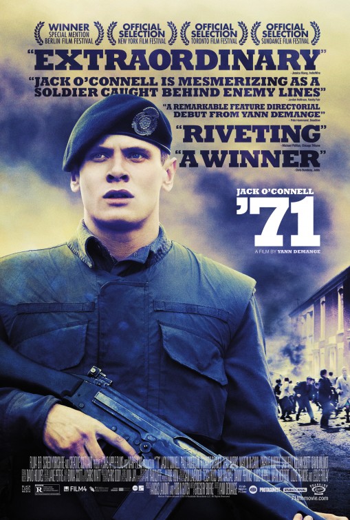
ANALYSIS Film Opening '71


Image result for 71 movie poster'71
Yann Demange (2014)
BBFC 15, MPAA Rated: R
Running time of the opening sequence: 3:17

Budget: £8M
UK/US/World Box Office: £1.2M, $900K, £2.1M
Theatrical distribution in 12 countries 
 
Production co's:  Warp
Production financing:   Film4; Screen Yorkshire; Crab Apple Films
UK, US theatrical distributors: StudioCanal

LINKS: IMDB; RottenTomatoes (Users 81%, Critics 96%); BoxOfficeMojo; The-Numbers; Wiki; Official site/page; Facebook.

TRAILER
...
https://www.youtube.com/watch?v=J-BaKfl1Ms4
...


TITLES

Number of people/company names in titles: 3


Start/end time of main titles: 0:00- 0:40


Running time of main titles: 40 seconds


The three titles are:


Image result for studio canalStudiocanal


The main distributor of the film is studiocanal. This is also the first opening of the film therefor the most important company involved with the distribution of the film 


Image result for Film 4Film4

This is one of the commissioners for the movie and is one of the main ones in the UK. They "present" the film alongside BFI


Related image

BFI

This is the company that helped finance productions of the movie


All of the titles have no music or sound playing in the background which can get the audience to hold their breathe waiting in anticipation of what is about to happen.


TITLES ANALYSIS: ROLES

Only two specific roles were given, with 6 companies being mentioned. The 6 companies are Film4, BFI, Screen Yorkshire, Creative Scotland, Crab Apple Films and Warp Films. Crab Apple and Warp films are the main companies who have produced the film alongside the other 4 companies  


TITLES ANALYSIS 3: GENRE/NARRATIVE CONNOTATIONS

The font for the titles are a mix of large and small text like in a billing block to only highlight the important information which is the companies being shown. The font is serif and is only capital letters. The logo of warp is also shown in the title. The font denotes that the genre is not a comedy but more of a thriller. It suggests a serious tone to the movie. The titles are all on a black background, with the non diegetic sound of two men boxing in the background and other men cheering them on to really get the sense for what type of film '71 is. After the titles are done the sound of boxing continues and creates an audio bridge for about 10 seconds then it cuts to the first shot which is set in a military base with the main protagonist boxing another man and having the other soldiers cheer on.


FIRST SHOT + THE PROTAGONIST


The very first shot is a close up of two characters boxing each other panning to the right. It is obvious they are boxing because of the gloves, the shirts being drenched in sweet and the blood on their faces and mouth guards.The miss-en-scene helps anchor what exactly is going on. The opening sets the mood straight away. It is an unusual opening for there is no establishing shot. We can tell who the main protagonist is. For during the boxing sequence the camera was always focused using a shallow field of focus on him and after the sequence was done, the camera tracks the man to using close up and medium shots to show his emotion and start to make us sympathise with him. There is no voiceover for it is not needed to establish the main protagonist.  


ADDITIONAL POINTS

The establishing shot can be argued to be after the boxing sequence where there is an extreme long shot of the soldiers running down a hill as practice for the army. However this is more known as a master shot.

The army/ military camp continues to be shown as the soldiers are all practicing and training to be a soldier. The last shot of the opening is of the soldiers practicing shooting and the cut to the main film is with a gunshot and then as soon as the gunshot is heard the screen goes black, then the scene changes and the plot begins to develop.


Wednesday, 20 September 2017